20 Dec How to Create Effective Business Cards
Business Cards
The need for a business card in today’s ever competitive world is absolute. It not only serves to identify you in relation to your business or organization, but it’s often your customer’s first contact with your company. And, in modern business, first impression is paramount.
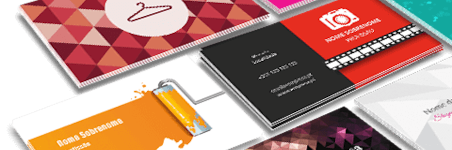
Creating fantastic business cards that’ll pop out in a sea of others isn’t always a walk in the park. Well, it isn’t rocket science either. With the following tried-and-true tips, you can come up with a business card that’ll get noticed.
Keep it Simple and Readable: Creating an easy to read business card is a no-brainer. Don’t attempt to squeeze in too much information. The small text often appears readable onscreen, but come out illegible when printed. It’s recommended that any text on your card shouldn’t be smaller than 8pt. And that isn’t all; the font itself should be simple and professional. For one, Comic Sans is a big no-no for a professional business card!
Don’t Forget Essential Information: think carefully when deciding what contact details to incorporate into your card. Don’t provide too many points of contact that your card appears cluttered. In our practice, you e-mail address, website, and phone number are crucial. For brick and mortar business, it’s best to include the physical address.
Keep the Colour in Line with Company’s Brand: it’s prudent to go for company colours in your card. If you don’t have one, you’ll have to choose a colour(s) that befits your profession. For business card design, designers typically use bright and bold colours to show that they are modern and updated. However, don’t underestimate the value of simple black and white array.
Structure the Card around the Logo: make it the most pronounced element in your card. This way, the person doesn’t have to go to text to know which company the card belongs to.
Stick to a few colours: again, colour choice is an important element that can make or break your card. The general rule of thumb is to use one or two colours.
Go for Thicker Cards: it’s important to think about the thickness of your business card. From our experience, cards printed on thicker stock tend to look and feel more luxurious, giving your card a professional appearance. Those printed on papers thinner than 300gsm obvious feel thin, making them appear cheap, if not tacky.
Wrap-Up: Once you receive your cards, it’s important that you give people more than one card. In fact, you need to use your business cards in all your correspondence. Don’t forget to carry them with you all the time.


